If you’ve ever looked at a candlestick chart and felt like you were staring at an alien language, trust me, you’re not alone. When I first started trading, I couldn’t make heads or tails of those little candles. I’d see green and red bars and think, “Am I supposed to feel something here?”
The truth is, candlestick charts are not as complicated as they seem once you break them down. If you’re wondering how to read candlestick charts for beginners, this guide will help you decode the mystery and start using them like a pro (or at least feel less overwhelmed).
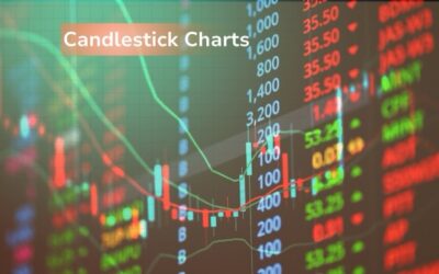
What Are Candlestick Charts Anyway?
Before diving into the details, let’s start with the basics: what even is a candlestick chart?
Candlestick charts are visual representations of price movements in a specific time period. They look like, well, little candles.
Each “candlestick” shows you four pieces of info for a given time frame (such as one minute, one hour, or one day):
- Open: Where the price started.
- Close: Where the price ended.
- High: The highest price during that time period.
- Low: The lowest price during that time period.
Why Candlesticks?
Why use candlesticks instead of just line charts or bar charts? Simple: candlestick charts give you more information in one glance. You can see the open and close, the highs and lows, and—most importantly—you can get a feel for the market sentiment (whether people are buying or selling).
Personal story: When I first learned to read candlestick charts, I was all about those simple line charts. But then I realized how much more I could see with candlesticks. Once I made the switch, it was like flipping a light on in a dark room.
Breaking Down a Candlestick
So, what makes up a candlestick? Here’s a simple breakdown:
- The Body
The body of the candlestick represents the range between the open and close prices. - If the close is higher than the open, the candlestick is typically green (or white, depending on your chart settings), showing that the price went up during that time period.
- If the close is lower than the open, the candlestick is red (or black), indicating that the price went down.
- The Wick (or Shadow)
The wick (the thin line above and below the body) shows the highest and lowest prices during that period. - The upper wick shows the highest price reached.
- The lower wick shows the lowest price reached.
Real-life Example:
Let’s say you’re looking at a 1-hour chart. If you see a candlestick with a green body and a small upper wick, it means the price started lower, rose up, and closed near its high—but didn’t reach much higher than that.
Common Candlestick Patterns to Know
Now that we know what individual candlesticks are, let’s talk about patterns. Patterns are crucial because they can help you predict future price movement. Don’t worry—you don’t have to memorize every pattern to start using candlesticks. But knowing a few common ones will give you a solid foundation.
1. Doji Candlestick
A Doji is a candlestick where the open and close are nearly identical. It looks like a plus sign or cross.
What it tells you: Market indecision. Traders are unsure of whether the price should go up or down.
My first Doji moment: I was staring at my first Doji pattern on a 5-minute chart, confused. “Is the market going to break out?” I wondered. But once I understood it meant indecision, I learned to wait for confirmation before making my next move.
2. Bullish Engulfing
A bullish engulfing pattern happens when a small red candle is followed by a larger green candle, and the green candle completely “engulfs” the red one.
What it tells you: Buyers have taken control and the price is likely to go up.
3. Bearish Engulfing
This is the opposite of the bullish engulfing. A small green candle is followed by a larger red candle, and the red candle completely engulfs the green one.
What it tells you: Sellers have taken control, and the price is likely to drop.
4. Hammer
The hammer candlestick has a small body with a long lower wick. It looks like a hammer.
What it tells you: It can signal a potential reversal, especially after a downtrend. The long lower wick shows that buyers pushed the price up from a lower point.
Personal anecdote: I first encountered a hammer during a pretty heavy market downturn. When I saw it, I thought, “What’s this strange candlestick trying to tell me?” After a few days, the price started to rise—just as the hammer had suggested.
How to Use Candlestick Charts for Trading
Step 1: Identify the Trend
Candlestick charts are best used in context. Start by identifying the overall trend: Is the market trending up, down, or sideways?
- If it’s up, focus on bullish patterns (like a bullish engulfing).
- If it’s down, watch for bearish patterns (like a bearish engulfing).
- If the market is sideways, keep an eye out for indecision patterns like the Doji.
Step 2: Look for Reversal Signals
Once you’ve got the trend, look for patterns that suggest a reversal. For example:
- In an uptrend, if you spot a bearish engulfing, it might be time to consider selling or holding off on buying.
- In a downtrend, a hammer could signal that the price is about to turn upward.
Step 3: Confirm with Other Indicators
While candlestick patterns are helpful, don’t rely on them alone. Use other indicators like:
- Moving Averages (to see the trend)
- RSI (to check if the stock is overbought or oversold)
- Volume (to see if the price movement is supported by strong trading volume)
Don’t Overwhelm Yourself—Start Slow
Reading candlestick charts can be overwhelming at first, especially when you see all the different patterns and indicators. But here’s the thing: you don’t need to know everything from the start.
Pro Tip: Focus on learning a few candlestick patterns first—like Doji, engulfing, and hammer patterns—and see how they fit into the larger trend. As you get comfortable, add more patterns to your repertoire.
Final Thoughts: Practice Makes Perfect
The beauty of candlestick charts is that they give you tons of information—once you know how to read them. But like any skill, it takes practice.
Start by studying one chart at a time. Notice how the candlesticks move and what happens after certain patterns appear. As you get more experience, you’ll start seeing these patterns everywhere, and you’ll feel way more confident making decisions.
Candlestick charts are a fantastic tool for beginners—and once you get the hang of them, you’ll have a much clearer picture of the market.
Next Article To Read: Top 3 Apps Every New Investor Must Download Today!